Color Basics in Visual Design
Jake Baker
|
Jan 1, 2024
If you want to create a stunning visual design, you need to understand the basics of color. Color is one of the most powerful elements of design, as it can evoke emotions, convey messages, and create contrast. In this blog post, I will explain some of the fundamental concepts of color theory and how to apply them to your projects.
The Color Wheel
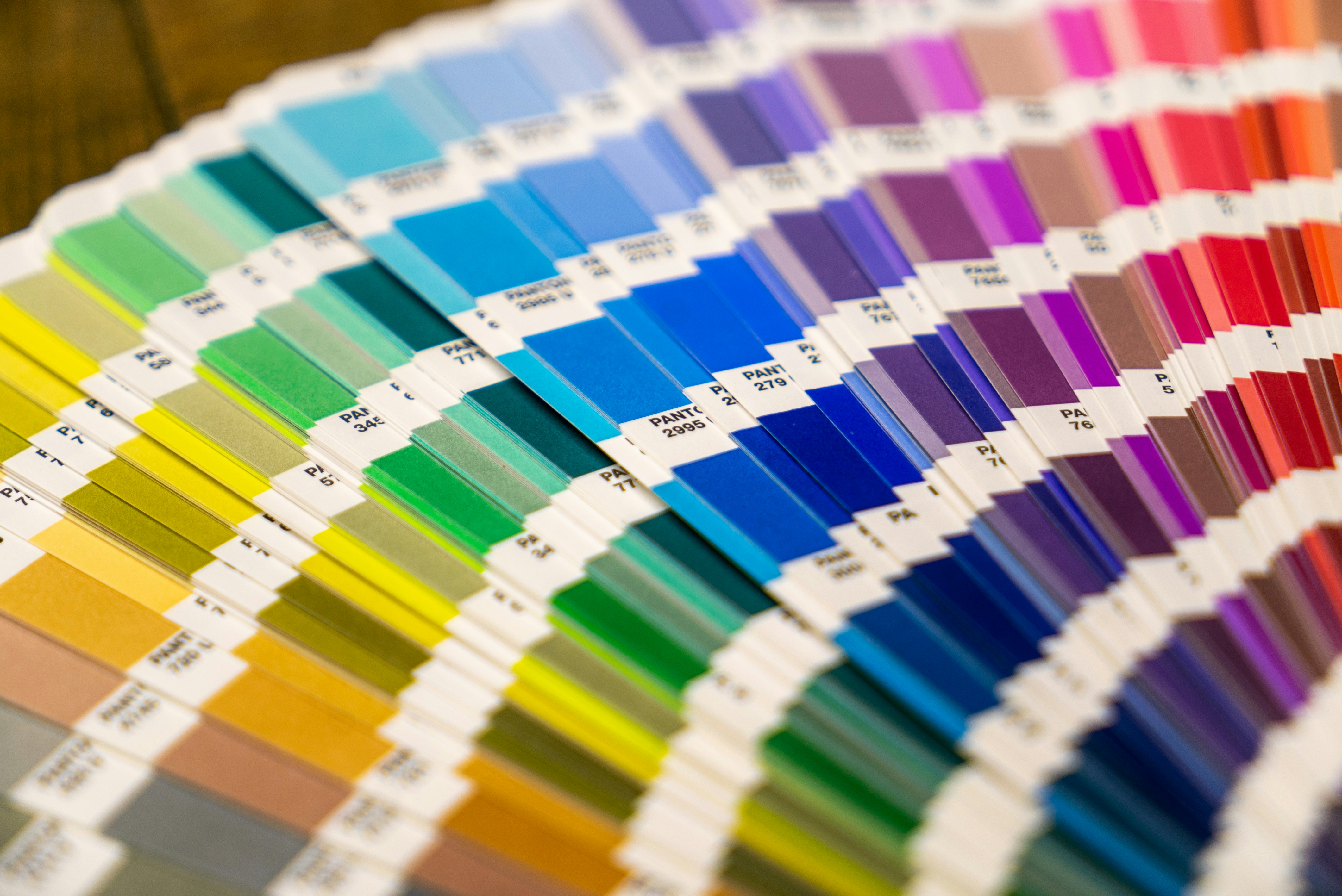
The color wheel is a tool that helps you visualize the relationships between colors. It consists of three primary colors (red, yellow, and blue), three secondary colors (green, orange, and purple), and six tertiary colors (red-orange, yellow-orange, yellow-green, blue-green, blue-purple, and red-purple). The colors on the wheel are arranged in a spectrum, from warm to cool.
The color wheel can help you create different color schemes for your design. A color scheme is a combination of colors that work well together and create harmony. There are different types of color schemes, such as:
- Monochromatic: This is when you use different shades or tints of the same color. For example, you can use light blue, medium blue, and dark blue for a monochromatic scheme. This creates a simple and elegant look.
- Analogous: This is when you use colors that are next to each other on the color wheel. For example, you can use yellow, yellow-green, and green for an analogous scheme. This creates a smooth and harmonious look.
- Complementary: This is when you use colors that are opposite each other on the color wheel. For example, you can use red and green for a complementary scheme. This creates a strong and dynamic look.
- Triadic: This is when you use three colors that are evenly spaced on the color wheel. For example, you can use red, yellow, and blue for a triadic scheme. This creates a balanced and vibrant look.
- Tetradic: This is when you use four colors that form two pairs of complementary colors on the color wheel. For example, you can use red and green, and blue and orange for a tetradic scheme. This creates a complex and rich look.
The Color Meaning
Another aspect of color theory is the meaning behind each color. Different colors can have different associations and effects on the viewer's mood and perception. For example:
- Red: Red is the color of fire and blood. It can symbolize passion, energy, excitement, danger, or anger. It can also attract attention and stimulate action.
- Yellow: Yellow is the color of sunshine and happiness. It can symbolize optimism, joy, creativity, or intelligence. It can also brighten up a design and evoke positive emotions.
- Blue: Blue is the color of sky and water. It can symbolize calmness, trust, loyalty, or professionalism. It can also create a sense of stability and reliability.
- Green: Green is the color of nature and growth. It can symbolize freshness, health, harmony, or sustainability. It can also convey a sense of balance and harmony.
- Purple: Purple is the color of royalty and mystery. It can symbolize luxury, elegance, creativity, or spirituality. It can also stimulate imagination and inspire innovation.
- Orange: Orange is the color of warmth and enthusiasm. It can symbolize fun, energy, adventure, or friendliness. It can also catch the eye and encourage interaction.
- Pink: Pink is the color of love and romance. It can symbolize sweetness, femininity, compassion, or tenderness. It can also create a soft and soothing look.
The Color Application
Now that you know some of the basics of color theory, how do you apply them to your visual design? Here are some tips to help you:
- Choose a color scheme that suits your purpose and audience. Think about what message you want to convey and what emotions you want to evoke with your design. Also consider who will see your design and what their preferences and expectations are.
- Use contrast to create interest and hierarchy. Contrast is the difference between two or more elements in a design that makes them stand out from each other. You can create contrast with colors by using different hues (e.g., red vs green), values (e.g., light vs dark), or saturations (e.g., bright vs dull). Contrast can help you highlight important elements in your design and guide the viewer's eye.
- Use harmony to create unity and balance. Harmony is the similarity between two or more elements in a design that makes them work well together. You can create harmony with colors by using similar hues (e.g., yellow vs orange), values (e.g., light vs light), or saturations (e.g., bright vs bright). Harmony can help you create a consistent and coherent look for your design.
- Use white space to create breathing room and clarity. White space is the empty space between or around elements in a design that gives them room to breathe. You can use white space to create a sense of spaciousness and simplicity in your design and to avoid clutter and confusion.
Conclusion
Color is a powerful tool that can make or break your visual design. By understanding the basics of color theory and applying them to your projects, you can create stunning and effective designs that communicate your message and impress your audience. I hope this blog post has helped you learn more about color basics in visual design. If you have any questions or comments, feel free to leave them below. Thanks for reading!