Type Basics in Visual Design
Jake Baker
|
Jan 1, 2024
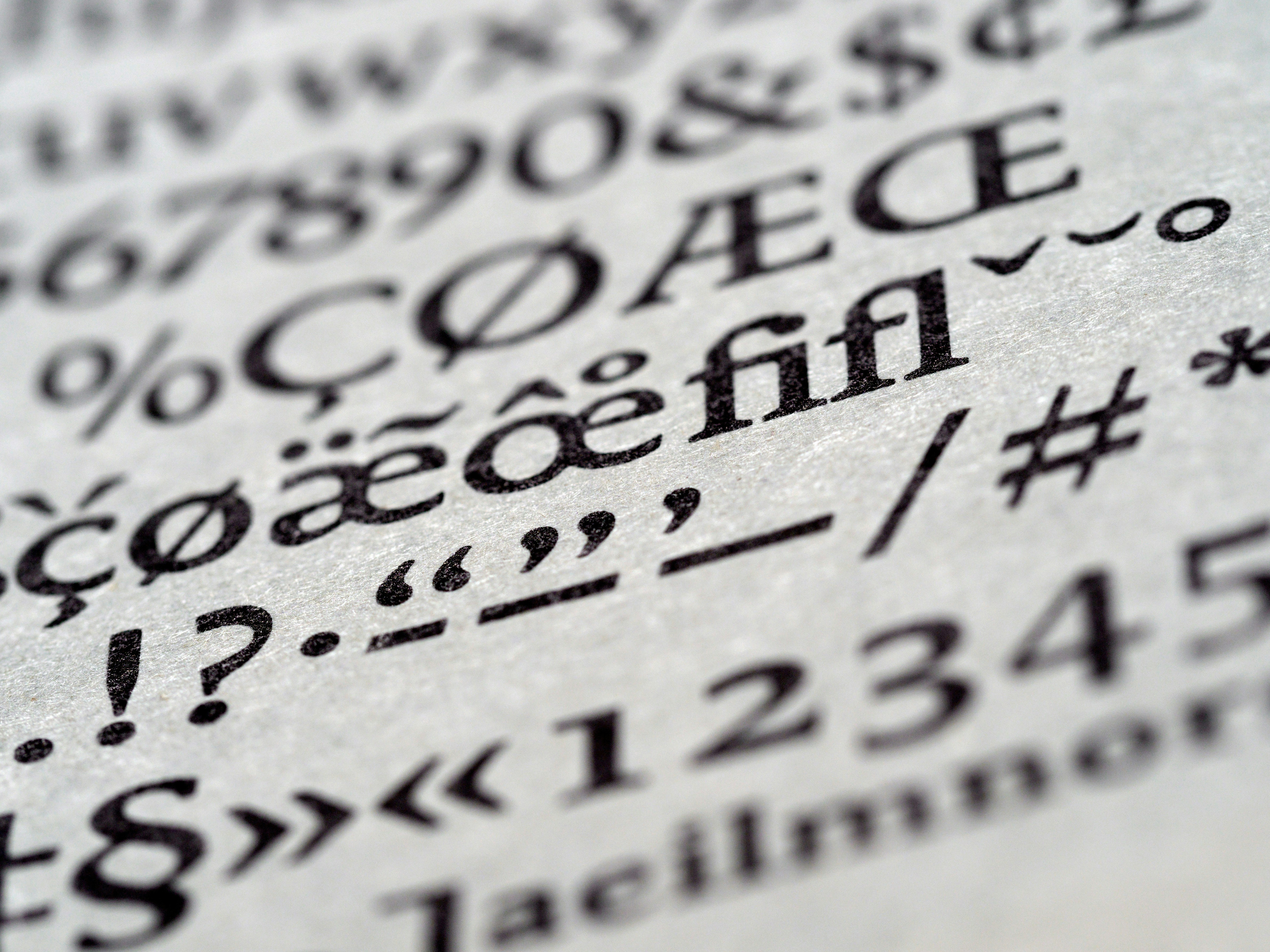
If you're new to visual design, you might be wondering what type is and why it matters. Type, or typography, is the art and technique of arranging letters and text to make them readable, attractive and meaningful. Type is one of the most important elements of visual design, as it communicates information, creates hierarchy, sets the mood and tone, and influences the overall aesthetics of a design.
In this blog post, I'll introduce you to some type basics that every visual designer should know, such as:
- The difference between typefaces and fonts
- The main categories of typefaces and their characteristics
- How to choose and combine typefaces for your design
- How to use type size, weight, alignment, spacing and color to enhance your design
Typefaces vs Fonts
A typeface is a set of characters that share a common design and style. For example, Helvetica, Times New Roman and Arial are typefaces. A font is a specific variation of a typeface, such as Helvetica Bold 12 pt or Arial Italic 14 pt. A font is what you use to display a typeface on your screen or print it on paper.
Typeface Categories
There are many ways to classify typefaces, but one of the most common and useful is based on their historical origin and appearance. The main categories are:
- Serif: These typefaces have small strokes or lines attached to the ends of the main strokes of the letters. They are often used for long texts, such as books, newspapers and magazines, as they are considered more readable and elegant. Examples: Times New Roman, Georgia, Garamond.
- Sans-serif: These typefaces have no serifs and have a more modern and clean look. They are often used for short texts, such as headlines, captions and logos, as they are more eye-catching and versatile. Examples: Helvetica, Arial, Verdana.
- Script: These typefaces mimic handwriting or calligraphy and have a more decorative and expressive feel. They are often used for invitations, logos and titles, as they add personality and flair to a design. Examples: Brush Script, Zapfino, Lucida Handwriting.
- Display: These typefaces are designed for special purposes and have a more unique and distinctive appearance. They are often used for posters, banners and signs, as they attract attention and create impact. Examples: Impact, Comic Sans, Cooper Black.


